In a hyperconnected world, businesses live and die by their online presence.
Local businesses, licensed professionals, freelancers, online entrepreneurs — everyone needs to develop their own website in order to stay relevant and competitive.
While building a website nowadays is easier than ever, some people aren’t exactly well-versed in the digital marketing sphere. The same can be said for self-proclaimed “freelance web designers” who heavily depend on templates and themes to get the job done.
As a result, most websites fail to garner an audience, generate sales, or do anything remotely beneficial to the company that owns them.
It may sound harsh, but that’s the internet for you, especially if you pursue a web development direction without being aware of the common pitfalls that can doom your success.
What are these pitfalls, you ask?
Don’t worry — we got you covered.
In this post, we’ll discuss the worst web design mistakes that you need to avoid at all costs.
Let’s begin.
1. Having Unclear Goals
Upon visiting a site and seeing your content, a user has one question in mind:
“What’s in it for me?”
Always remember that users only care about the value they can get out of your website. They’re not there to admire your design or content writing skills — they only want to know how you can help them accomplish their goals.
That’s why every single page on your website must highlight your value propositions right off the bat. Make it evident in crucial conversion elements, particularly your headline, subheadline, and call to action.
Here are some tips to help you make these page elements more impactful:
- Headline
The number one rule when creating a headline is to make it punchy. You can ask a question, open with an eye-opening statistic, or drop actual numbers, like: “Grow your traffic by 200% in 30 days!”
- Subheadline
Since you’re not supposed to write a long headline, you should rely on a subheadline to add more context. Describe the benefits your audience can expect or what they need to do once they decide to take action.
- Call to Action
After you pique the audience’s interest with the headline and subheadline, the call to action (CTA) must take over and seal the deal. Make sure it contrasts with the background and avoid words that add friction, such as “Register,” “Apply,” or anything that indicates a tedious conversion process.
2. Being Too Simple
Speaking of highlighting value propositions, nothing else comes close to visual content when it comes to grabbing your audience’s attention.
Research shows that colored visuals can increase readership and brand recognition by 80 percent.
While minimalism and simplicity are indeed perfect for maximizing the readability of your content, plenty of novice web designers take it too far. Most of them end up with bland, monochrome websites that’s downright unappealing.
That said, don’t be afraid to incorporate an ample amount of visual content into your website.
It doesn’t have to be over the top — simple infographics, for example, should be more than enough to make your value propositions and unique selling points more presentable. They can also be used to make statistics and other data-driven information more digestible.
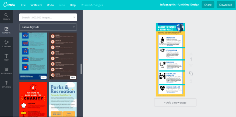
Fortunately, you don’t need a professional graphic designer to start rolling out visual content on your blog. A free tool like Canva can help you develop professional-looking infographics within minutes:

Of course, the output of professional graphic designers should still be superior to what you can concoct with free, drag-and-drop tools. But since Canva is free, it should give you enough breathing space as you try and allocate a budget for visual content.
3. Neglecting Loading Speed
After spicing up your website with visuals, your next priority is to make sure they don’t compromise your website’s loading speed.
Bear in mind that assets like images and custom codes take up precious bandwidth as a website loads. The larger these files are, the more bandwidth a website consumes to be loaded properly.
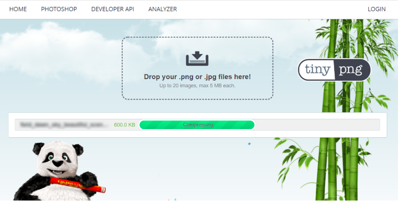
To keep your website’s performance consistent, use compression tools like TinyPNG, Compressor.io, or Minify Code to shrink the file sizes of images and various types of codes.

If you cater to users from all around the world, consider leveraging a Content Delivery Network (CDN) to optimize the transfer of website data. A CDN reduces latency by distributing the load of content delivery across multiple proxy servers.
4. Not Optimizing for Mobile Users
In case you didn’t know, mobile users now account for more internet traffic than those on desktops.
This means it’s about time for you to adopt a “mobile-first” approach when structuring your web pages.
The good news is, most website platforms and content management systems (CMS) mostly feature responsive themes and templates, which means they automatically adjust to match the size of the display being used.
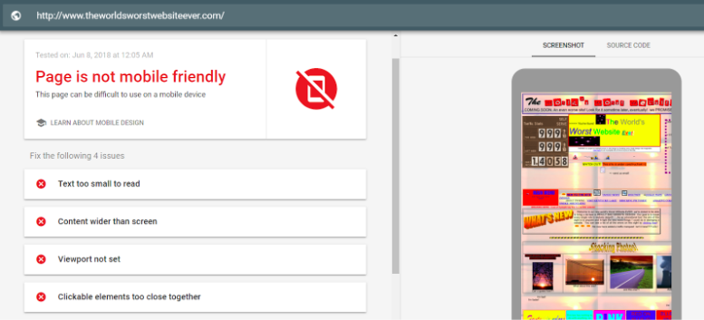
Still, you should use the mobile-friendly test feature on the Google Search Console to receive more insights and suggestions on how you can improve the experience of mobile users.

5. Being Reluctant to Get Help
Finally, a lot of website owners have a “lone wolf” mindset when tackling the challenges of website development.
It’s true that, given enough time, any person can learn the ropes and be reasonably competent with every aspect of web design — thanks to the wealth of learning resources available online. But if you really want your website to stand out, you need to kick the “one-man-army” mentality and forge connections with professionals who can help you. But if you really want your website to stand out, you need to kick the “one-man-army” mentality and forge connections with professional web designers and developers who can help you.
Hire freelancers or consultants to fill the knowledge and skill gaps that prevent you from building the best site possible. You should also consider outsourcing content developers to keep your website supplied with fresh, engaging posts for your target audience.
To start looking for the manpower that can attend to your needs, you can depend on freelancing marketplaces like Upwork or Fiverr. You can also post listings on websites like Craigslist to cast a wide net.
Conclusion
Having a website up and running is only a small step towards an authoritative online presence. What you need is to adopt the fundamental marketing philosophies and apply them whenever you make pivotal design decisions.
Understanding the mistakes listed above is a step in the right direction. Just be patient, focus on one thing at a time, and remember that success never comes overnight.
Are you guilty of any of the mistakes above? What advice can you give other readers who face the same issues?
Whatever your thoughts, feel free to leave a comment below!

Comments are closed.