
Creating a website for your startup business seems like a pretty straightforward process. All you need to do is create the basics of a business website, add texts, colors, your branding elements, and all the necessary components and you’re good to go, right? Well, not quite.
If you want to build an effective website, you’ll need to consider many factors, such as your target market and conversion goals (among others), on top of designing your site for usability and functionality. Additionally, it’s important to keep in mind that startup customer service is a key element, so make sure to include a clear and easy-to-find service section or contact information in the website.
When creating your startup business website, it’s essential to be aware of web design tips and tricks that can make a significant impact. Collaborating with a reputable web design company can help you implement effective strategies, such as clear navigation, compelling visuals, and responsive design, ensuring your website establishes a strong online presence and engages potential customers effectively.
The good news is, we’re here to help with these five crucial web design tips and tricks you should know to create a high-converting website for your startup business.
1. Create a web design strategy
Building and designing an effective website starts with strategic planning, so before you dive into the actual design process, come up with a web design strategy. Doing so helps ensure you don’t forget any essential website elements and components. As such, you avoid wasting time and resources going back and forth to correct and add anything you might have missed.
Even if you won’t design your website yourself and work with a professional web design company in manchester instead, it helps to have a design strategy in place to guide the site creation process.
Consider the following questions when creating your design strategy:
- What key message do you want to communicate to your audience?
- What essential features do you plan to showcase?
- Who are your ideal buyers?
- What features and functionalities will your potential customers expect your website to have?
Use the answers to these questions to help you outline your web design strategy. Work with your team to bring out solid ideas and lay out the initial plans for your website. You can streamline your collaboration and planning processes using effective team project management tools such as Teamwork.
The platform offers the tools you need to create, track, and manage projects and tasks. You can add comments, upload files, and get everything in one location.
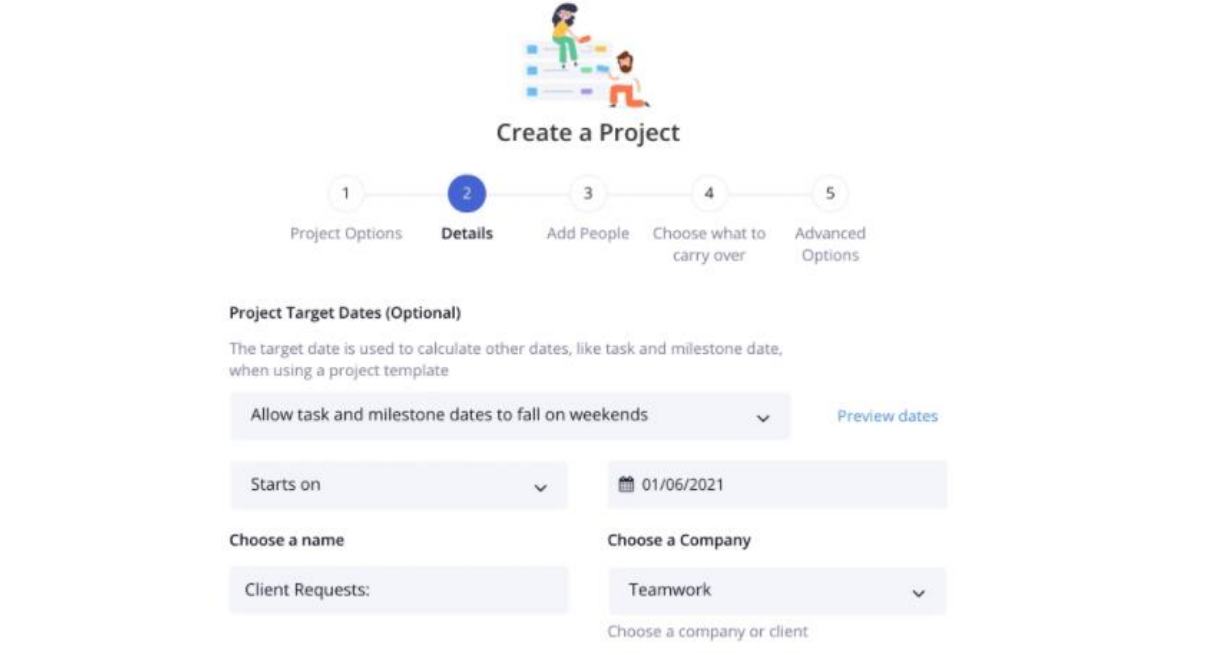
View your projects as a Gantt chart, a task list, or board. You can customize your workflows and use advanced portfolios and workload management tools such as time tracking, reporting, and dashboards.
Speed up creating your website by using a team project management tool and creating your design strategy to guide your website building process.
2. Establish a theme for consistency
Keeping your website design consistent is crucial to help show your brand as professional and trustworthy. It’s also one of the core web design principles you need to adopt to help boost brand awareness, customer recognition, and, in turn, your conversion rate.
That said, ensure you have a standard format for each piece of content on your websites, such as your color schemes, headings, typography, branding, and other elements. Consistent formatting helps make your website design and content more visually appealing and visitors recognize your brand.
Consider using the same font across your web pages when possible, stick to your standard color palette, and use the same core messaging, voice, and style in your copy. Adopting a standard format doesn’t mean you should limit your design. Instead, find a balance between consistency and creativity when building your website.
This can help you create a website that is both functional and visually appealing while remaining consistent with your branding and business goals.
3. Provide clear navigation paths
If it’s challenging for visitors to browse through your website, let alone find what they want quickly, they’re likely to abandon your site and look elsewhere. This can increase your bounce rates while lowering your conversion opportunities, which isn’t ideal if you want your business to succeed.
The solution? Design clear navigation paths to make it easy for potential customers to browse your site — from your landing page to your checkout page. Clear navigation paths simplify navigating your site, making it easier for your visitors to move from one page to the next, and encouraging them to explore more about your products and services.
Simplify designing your website’s navigation structure by using top-tier ecommerce platforms for small businesses.
For instance, Square Online lets you build and publish your e-commerce website quickly using the platform’s no-code, easy-to-use store builder feature. You can customize ready-made templates designed with eCommerce best practices in mind — including clear, user-friendly navigation paths.
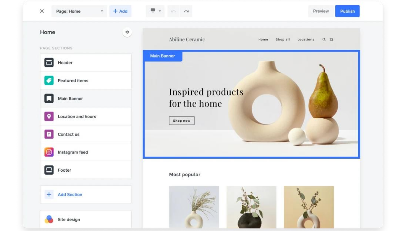
With reliable eCommerce website builder solutions, you won’t need to build your website and design your navigation paths from scratch. You can choose a template and customize it as you prefer while ensuring all the necessary navigational cues, elements, and structures are in place.
4. Organize your product pages
How you organize your product pages is crucial to turning your passive website visitors into paying customers. After all, if your product pages don’t make it easy for customers to find items they want quickly, they’ll end up confusing and frustrating shoppers. Your visitors end up leaving instead of buying from your store.
Make it easy for your potential customers to find your products by organizing them into specific categories. For instance, you can add a menu bar to your product pages to allow shoppers to look through product categories quickly. It’s also a great way to give a glimpse into your main products and offers.
The Marks & Spencer website is a classic example of this.
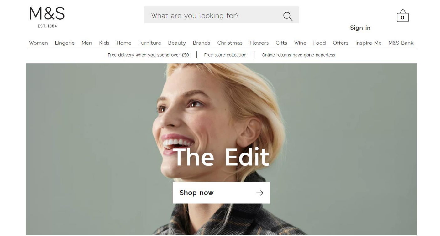
All the product categories are at the top menu header with the sub-menu shown below. You can also include a search bar feature to make it easier for shoppers to type in specific items and find them on your website quickly. What’s more, you can go a step beyond a search function by creating an app that streamlines finding products on your website for shoppers.
You can include highly customized filters for users to find specific items based on the size, variation, and style (among others). Remember to run regular backups of your app codes, data, and other business-critical work items to ensure everything is secure.
If you use Azure DevOps to build your app, use automated solutions such as Backrightup. Backrightup lets you automate your Azure DevOps backup so your important data, repositories, codes, etc., are safe and intact. This way, you avoid losing any data in case of accidental deletions or issues, such as server crashes and malware attacks.
Regular backups also help you keep your app running properly and smoothly so it doesn’t crash and potentially ruin your customers’ user experience.
With a highly customizable product search app, shoppers won’t have to go through all your catalogs to find the particular items they want. It improves the user experience, encouraging them to check out their items (and buy more).
5. Make it mobile-friendly

It’s better to design your website to be mobile-friendly and adaptable to multiple screen display sizes from the get-go.
After all, people prefer using their mobile devices to browse the web and shop online. If you don’t design your website to be mobile-friendly, shoppers are bound to have poor user experiences with your site, which can seriously hurt your conversions and sales.
Also, mobile-friendliness is one of Google’s ranking factors. This means the more your website meets Google’s requirements, the better your web page’s chances of ranking higher in search results.
Follow these quick tips when designing a mobile-friendly website:
- Avoid using dual websites. Instead of creating separate websites for desktop and mobile, use one URL for both to improve your search traffic.
- Ensure proper font and button sizes. Ensure your texts and buttons are easy for mobile users to see, read, and click on smaller display screens. Keep your font sizes to a minimum of 14PX (11 points for iOs) and your buttons at 44PX by 44 PX. Use one typeface and utilize white space for better readability.
- Don’t use Flash. Flash doesn’t work on most mobile devices and drains resources so you’re better off staying away from it. However, remember to make your image, CSS, and JavaScript files available to Google via the Google Search Console.
Additionally, ensure you use high-resolution images and photos for your website. If shoppers have to squint or keep zooming in to see smaller details in your product photos, they’re bound to have a poor user experience — which won’t help convert them into buyers.
If you are working with a leading web design agency you do not need to worry about this problem. Mobile responsiveness and optimization are a basic tick box that leading designers and agencies understand. They are also aware of the fact that a website that is not optimized for mobile screens can hamper SEO prospects and planning.
Create an awesome website with these tried and tested design tips
Learn a thing or two from these useful web design tips. While you have unique business needs and there’s no one-size-fits-all formula to designing the perfect website, the tactics in this guide can be your jumping-off point to running a successful startup.
Comments are closed.