The internet is by far the best chance we mere mortals have for building a great life for ourselves, you agree?
And how can we achieve that? By building a website, our very own online businesses, open 24/7.
That’s great and all, but there’s a problem…
Which is…?
We are not only ones doing it! It took me 3m to write this introduction, and in that tiny speck of time, 10 000 new blog posts saw the light of day.
We need to stand out!
We MUST stand out! Or be drown in the noise.
How?
Since the reader is everything, I propose focusing on their wants and needs. In other words, let’s make a killer site.
Here are 3 ways to boost your UX, quick and easy.
#1- Add a reading progress bar to your site
What is a reading progress bar?
The name bares it all.
It’s a brightly colored bar that goes on the bottom/top of your page, and as the reader reads and scrolls, it follows along, serving as a visual cue as to how much of the post remains.
It’s elegant, and excellent UX because:
When you show it- you’re being transparent about your blog post
Transparency=honesty.
Not everyone has 15m to spare on that awesome monster post of yours. But if you tell them in advance that 15m is how long it’s going to take, they’ll thank you for it.
Why exactly?
Because human brains are hard-wired to finish the job once started, and they absolutely hate leaving the job half done.
If you’re human, you must have felt the sting of unfinished work?
It bothered you big time, no? it didn’t feel good, right?
So don’t force people to NOT finish reading your post. They’ll be angry at themselves, and at you.
Instead, warn them in advance and reap the rewards.
Note: this is just a preview of the awesome benefits reading progress indicator gives. If you want the full scoop (and setup tutorial ) make sure you click the link below.
- Suggested reading- Learn How to Add a Reading Progress Bar in WordPress- And Why You Should
Bonus: Estimated time to read
Note: this may or may not help your UX, and it might even hurt your SEO.
What is it?
It’s basically an estimate on how much time is needed to read the post (based on word count).
So if you have a 3000-word post, it’d be 15m; 4000 words=20m
Why is this bad?
Because if people see some humongous number they might bounce right way. That is called pogo sticking and it can ruin your SEO.
So be careful with it.
Why is it good?
Because you’re pushing transparency to extreme. People will be grateful you respect their time.
Here’s how to set it up.
You don’t.
I mean, you don’t need another plugin. The same one (Worth the Read) that handles your reading progress bar also lets you show “estimated time to read” number.
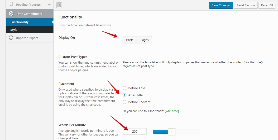
So, In your WP dashboard, simple find “Worth the Read” tab and click it. Then choose “time commitment“.
And here you can set it up:
- Display on– posts and pages
- Placement– after title
- Words per minute– 200. That is the average reading speed for most people
Note– I used to have this feature on my site, but don’t anymore. Because I think that the cons far outweigh the pros. When folks arrive and see “20m estimated time to read”- most of them leave.
And I love my website, so…
#2- Content table for UX- how they help your site (+tutorial)
Tables of content are a true boon to your site’s UX.
They:
a) Give an overview of your posts and help the reader decide whether to stay or bounce.
This is either good or bad, depending on the post, and I’m sure you can guess why.
Because, if your article is shallow fluff that you banged out in 30m or less, and a total stranger to the phrase “content depth” then folks will see it and bounce back to Google. That’s bad for your SEO.
However, if you’ve written a true guide (as you should have), then that humble table of content becomes an asset because people see that FINALLY- their prayers have been answered:)
b) Content table saves precious time- because folks can simply click and go wherever it is they want to go
As you probably know, time is our most precious resource. We can’t get any more of it, and we’re already wasting too much of it.
And if you, as a webmaster, go out of your way to show people “hey, this is a clickable, internal link! Click here and GO!” then they will really like you for it. I mean who wouldn’t?
Let me answer that- only a time-wasting masochist:)
Here’s how to get a content table for your site (tutorial)
First, install this plugin (https://wordpress.org/plugins/easy-table-of-contents/).
It’s both free and up to date.
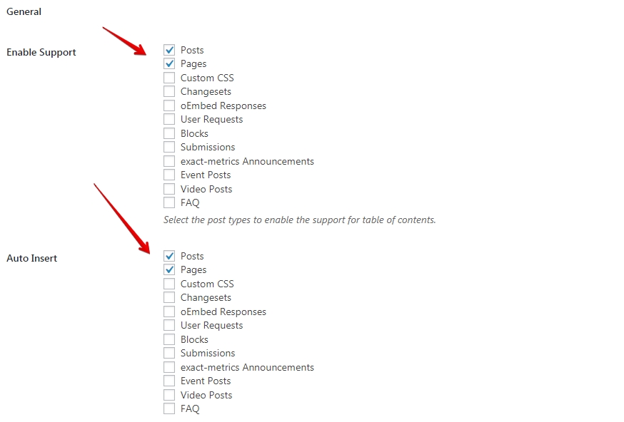
Then, from your WP dashboard, go plugins/installed/Easy Table of Content/settings
Once there:
- Enable support– post and pages, because they’re usually content rich
- Auto insert– posts and pages. This is set and forget, which is what I really like
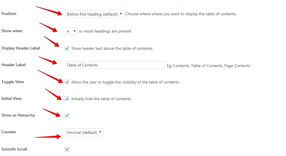
- Position– before the first heading
- Show when– I select 4 because shorter posts don’t need content tables- they’re redundant
- Header label– table of content (default)
- Toggle view– yes; good UX
- Initial view– hide at first
- Show as a hierarchy– yes
- Counter– decimal
And that is it. Of course, there is a lot more option to tinker with. But for starters, this is enough.
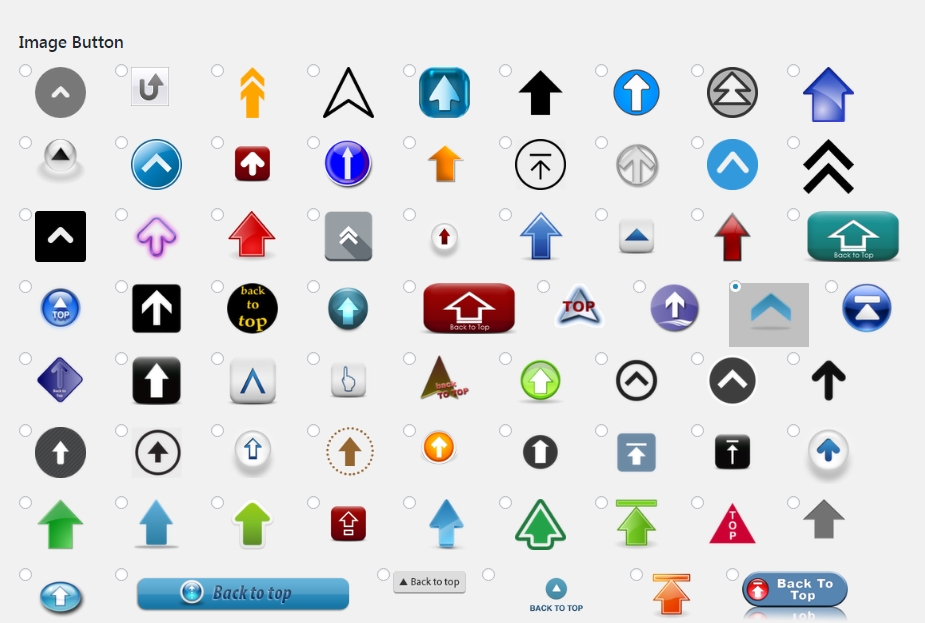
#3- The “return to top” arrow
This plugin works best in tandem with content tables.
While they pull folks in the middle of the post, this arrow draws them back… so they can choose and plunge right back in.
Again- people hate wasting time. And you should make your site’s experience akin to a well-oiled machine.
No squeaking, or screeching. Just click-go-enjoy-subscribe-buy-leave; and come again:)
Now that you understand why you need this feature allow me the pleasure of showing you how to get it for your site.
See, even my tone is pleasing to you, the awesome reader:)
WP Front Scroll Top (tutorial)
First, install the plugin (https://wordpress.org/plugins/wpfront-scroll-top/)
Then, in your WP dashboard, go: plugins/installed/WP Front Scroll Top/settings
Once there:
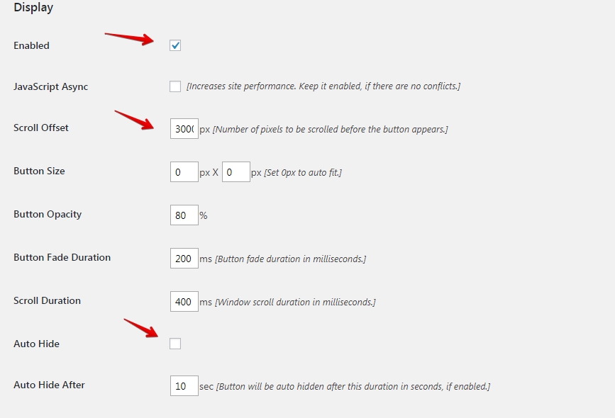
- Enabled– yes
- Scroll offset– 300px- this is how far they have to scroll for the arrow to appear
- Auto hide– no, because it’s not obtrusive by any means
- Button style– image
- Button action– scroll to top
- Location– bottom right- best for usability
Now, just choose a button you like:
And that’s it. Simple, right?
And here’s how it looks on my site (notice in the right lower quadrant certain the pale blue arrow)?
![]()
Conclusion- Better UX- doesn’t seem so hard now, does it?
Do it.
Improve your UX anyway you can, and reap the rewards for doing so.
While it is true that readers today are kind of spoiled with all the choice they have, they’re also kind to those webmasters who try to please them any way they can.
And site visitors show their kindness by:
- sharing,
- commenting
- linking
- buying
- recommending your business to others
Trust me, it’s an incredible place to be at, and I showed you the first three steps you can take to get there.
Start slow and work your way up.
But not before you leave a comment to tell me what you think:)
Comments are closed.