How You Can Write Awesome Readable Content Your Readers and Search Engines Will Love!
It really surprises me on the number of content and article writers out there that have never heard the word “readability”. Wait a minute…actually, I am not surprised by this at all! This seems very new to anyone starting an SEO journey
As for myself, I really didn’t start to take notice of this until my all time favorite WordPress plugin Yoast Seo integrated readability as a core function.
I didn’t pay much attention to my Yoast readability scores for a good long while. But after some time, I really just got tired of those ominous glaring red dots staring at me!
Then, I finally decided to take some action and learn what this readability stuff is all about. After all, for years I have been designing websites, am an aspiring SEO consultant, and always write content with the intent of optimal SEO practices.
What Exactly is Readability?
To put it simply: readability is the measurement of ease in which the reader can understand any written text.
Most of the current readability tests give us the result of a grade level reading comprehension. Based on my research, it has been agreed by many, that Google wants your content easily understood by an 8th grader (13-14 years age). But, they recommend your web content to be written more toward being understood by a 6th grader.
Readability is not a Google Ranking factor…yet. But, with their latest algorithms and updates, human behavior on a web page has become an indirect ranking factor.
And guess what? Human behavior is greatly affected by the level of content readability.
What is the Human Science Behind Readability?
There are several scientific factors that determine how a readability score is calculated. Take a close look at these and see how they apply to you when reading some web content.
- Eye movements
- Being recognizable at a distance
- Speed of perception
- Reading speed
- Reflex blink technique
- Having good visibility
- Having good perception in peripheral vision
- Fatigue while reading
What Tests are Used to Measure Readability?
There are several tests out there being used for readability scores. Most of these give you the result of a grade level ease of understanding.
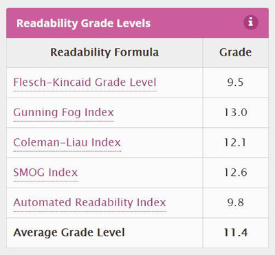
Some of the more popular tests are: Flesch-Kincaid, Gunning Fox Index, Coleman-Liau index, and the SMOG index.
I am an avid WordPress user. As a result, I get the luxury (like the other 5 million plus), of using the Yoast SEO plugin. The team at Yoast has integrated the Flesch Reading Ease score in this plugin.
This algorithm is based off the total amount of syllables in a word and the amount of words in a sentence.
Therefore, writing shorter sentences with shorter words is the objective. This makes complete sense to me. Sentences that are long and filled with technical jargon can be painful to read.
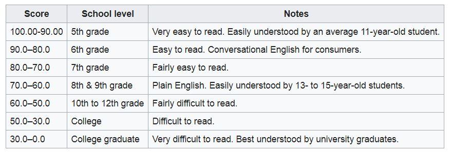
Flesch Reading Ease
Not every online business and blogger uses WordPress. I get that. Fortunately, there are two readability tools I highly suggest.
One is free, and the other is very inexpensive:
webpagefx.com (this is free and gives you a quick idea where your content is at)
readable.io (inexpensive – worth every penny, and has all the readable tools and resources you will need)
Understanding Passive Voice and Transition Words
I bring up these two readability elements for a few reasons. Google’s Rankbrain is geared more toward semantics and human behavior. Yoast integrated these elements into their plugin for this very reason. Human behavior and semantics!
Not writing in passive voice is always a challenge for me. However, the Yoast team brings up some great points. Passive voice is too wordy and more difficult to understand.
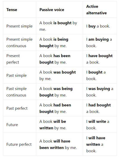
Look at the example below. With passive voice – the verb uses past tense (bought, being bought, has been bought). The better alternative does not.
I recommend that you read this passive voice article from the Yoast team.
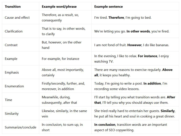
I understand transition words much easier than writing in active voice. However, this is still a practice I continue to learn and advise you to do the same. Yoast suggest to us to use transition words for the same reason to use active voice.
Transition words will make it easier to read and understand the text. Furthermore, you will show your reader the relationship between two phrases and sentences.
The Hidden Value of Readability and its Indirect Effect on SEO
Hopefully, up to this point, you now have a better understanding of Readability and some of its effects on human behavior. It is time to bring this practice and correlation with SEO into a broader light.
There are direct ranking factors Google uses from your website content.
Here are a few of the common article content factors Google directly ranks for:
- Meta tags
- Keyword decorations
- Keyword density
- Image alt tags
- Grammar in your article
- Page title
- URL
These factors are all very important. I highly suggest learning and to continue to use these practices.
However, in my honest opinion, the meat and potatoes for content/article SEO success – comes from Google’s indirect ranking factors.
And guess what? Quality content readability plays a huge role in all these factors!
- Bounce rate
- Exit rate
- Time spent on page
- Total number of sessions
- Conversion rate (CTR)
- Social sharing rate
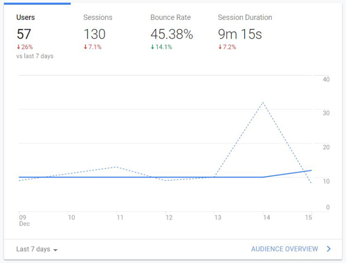
What does this tell me? I need to write for humans and not just for search engines. Writing quality, relevant, and readable content with user intent in mind, will do wonders for your SEO results!
In addition to what I have already discussed, I am listing my 5 top practices for awesome content readability.
Some of this is a partial review, but most of these practices have not been discussed.
5 Golden Tips for Improving Your Content Readability
#1. Write Shorter Sentences With Shorter Words
I have discussed this in the previous sections and the importance of writing shorter sentences with shorter words. It is a big factor in the Flesch–Kincaid test, and many of us use this test with our Yoast SEO plugin.
Remember those transition words? These can really help with connecting and relating two short sentences. Hence, making it much more fluid and easier to break up those longer sentences.
Unless you are writing a very technical article, stick with short and easy to understand words. Don’t confuse your readers with unnecessary jargon.
Finally, from a user/reader standpoint, I can literally see the value in all this. I don’t want to read a sentence that could easily be a paragraph.
And above all, I don’t want to have to look up every other word in Wikipedia!
#2. Use Your Personality and Write Conversationally
The title speaks for itself here. When writing content, I try to picture myself having a general conversation on the topic. In other words, speaking live with another human being.
I don’t want to be a robot, and don’t want to write like one either.
When I write thinking of conversation, my sentences end up being shorter and my words tend to be more fluid.
The more web content and articles I read, the more I appreciate the personality behind them. Personality in writing plays a big factor for me to continue to read on, share, comment, and return.
#3. Pay Special Attention to Your Typography
The typography you use can really make or break your readability. Everything from font size, family, style, color, line height, and line length, is crucial on the eyes of your readers.
Therefore, I really suggest keeping your typography simple and easy on the eyes!
Font Family
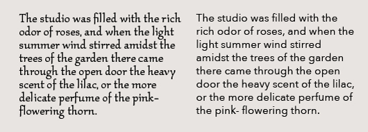 Image Source
With the advent of Google Fonts, it’s tempting to get fancy with your fonts. I generally like to stick with the old school ‘web safe’ fonts.
Arial, Verdana, Helvetica and Georgia will always render safely on all browsers.
I recommend using sans-serif fonts for your body text. These are meant for easier reading on the computer screen. Arial and Verdana work well.
Serif fonts have decorative markings and are better used for print.
Font Size
I have gone back and forth on this for what seems to be years. I do a lot of on screen reading and have come to the conclusion that the recommended font size of 16px (1em) for body text works fine. My recent preference has been 17px…just the perfect size for my vision.
To me, text size is a really important factor for good readability. I find myself constantly bouncing off a web page due to tiny or huge body text.
An example of this: I landed on a really great site with some fabulous content. They had written hundreds of great articles covering a variety of topics I read and write about.
But, you know what? The body text was so small, sadly – I had to leave all that great content behind.
H1 – H6 Headings
This is all based purely on opinion. I have been generally making my headings a bit smaller these days.
For me, it feels like I bring more attention to the body content at hand, by using a slightly smaller heading size.
My present day personal preference for articles:
H1 – 24px
H2 – 22px
H3 – 21px
H4 – 19px
H5 – 18px
H6 – 17px
Line-Height
White space does wonders when I am reading on screen. Therefore, I suggest a sizable line-height. A 150% line-height to text size ratio seems to be the minimum standard today.
A 16px (1em) text size would translate into a 24px (1.5em) line-height.
Don’t forget about text color! This should be “black & white” to us all, but not always that easy. I would keep a stark contrast for body text color to back ground color.
#4. Use Proper Formatting & Hierarchy With Your Style In Mind
Writing a great article for your readers should entail a good bit of logic. There should be a beginning, middle, and end. Enticing headlines should not be overly focused on keywords, but a logical explanation of what they are teaching your readers.
Stick with creating a clear outline:
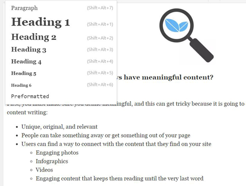
- Use your headers and sub headers adequately to segment your content
- Make sure they are in order, with your Title being the H1 tag, H2 Secondary Title, and H3 is great for sub topics
- Create bullet and number lists where appropriate
- Use bold or <strong> text in the beginning of a line to emphasize or as a sub topic
- Italics are great for emphasizing important phrases as well
Paragraphs and Sentences
I am not a fan of reading paragraphs with more than 5 sentences. Let’s check that…no more than 3 sentences. Bloggers have evolved, and the new style is 1 and 2 sentence paragraphs…which I really love!
3 sentences can be fine too, as long as they are mixed in well.
This is purely my opinion, but I have read countless articles, and the better user experience for me, is this style of writing.
If I happen upon an article with a bunch of condensed long paragraphs, this eye sore immediately tells my finger to click on that X in the corner!
#5. Use Multi Media – Images Videos Podcasts and Call to Actions(CTA)
First of all, anytime I get on a website for a good article to learn from, there better be some sort of image, graphic, video etc. If you want to watch your bounce rate sky rocket, leave your articles lifeless with no visual imagery for your readers.
Images and videos are a key element for holding the attention and keeping your users interested. I highly suggest a good and well balanced mixture of imagery or anything that catches the eye of your visitors.
Just my opinion, but I suggest you should add an image, video, or call to action for on average of at least every 200-250 words.
If you are writing a quick and short post with a link to a Facebook video or something of that nature, then this is a different story.
Images: Should explain, teach, or showcase for your readers: examples, statistics, diagrams, charts, info-graphics, food items, travel places, products etc.
Videos: Work excellent for tutorials, reviews, and references. And easy to embed in your articles.
Call to Actions: Add these when totally appropriate. Click to Tweets, Related Articles, Contact Buttons.
I suggest hiring a web design expert to help you out with multi-media and integration.
Wrapping Things Up…and the Final Results!
Just to get to the point, there is no direct correlation with your readability scores and Google using these as ranking factors. My main goal for writing and sharing this article is to reiterate that there is a direct relation with content readability and human behavior.
Well written articles using the suggested readability practices will bode very well for your users as they will stick around, click, purchase, share, and return again. Google likes this. Continue checking your analytics and see for yourself!
And my final result is…
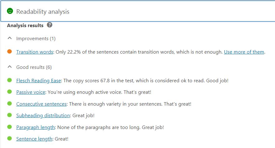
Those darn transition words! The ones I mentioned earlier, that were easy for me to comprehend?!
Not perfect, but I guarantee you that my awareness level of writing and readability has completely evolved since the very beginning of writing this article.
Bonus From Yoast – “Should all bullets be green?”
“This is a question we often get and no, not every bullet has to be green. What you should aim for, though, is a green bullet overall – the one in the tab that reads Readability.
Having an orange bullet like in the screenshot above is ok. It’s not that your article won’t be able to rank if it doesn’t pass all of the tests. This is merely an indication, not a necessity.”
– Yoast
If you like this post, share and Save on Pinterest:


Comments are closed.