Though playing around with web design features is fun, it’s easy to go overboard with all the bells and whistles. Resist the urge to include design elements simply because you can or because other websites are using them.
It’s more important to design a site that is effective and easy for your users to navigate, and if you resort to a company to handle those tasks, G Squared web design Sydney are the pros you’re looking for. On the other hand, if you’re the type that likes to roll up their sleeves and do it yourself, avoid including these five annoying features.
1. Obnoxious Pop-Ups
Your site needs a place for users to enter their email addresses and join your newsletters. However, don’t annoy your users with obnoxious pop-up email boxes when they’re in the middle of reading an article.
It’s even more annoying when pop-up advertisements interrupt your users, especially when the ads are unrelated to the article your users are reading. There are ways to design email sign-up forms and place advertisements that are unobtrusive and effective. Be respectful of your users and resist overly aggressive pop-ups.
2. Autoplay Videos
Another strategic web design feature is the autoplay option for videos and audio. Autoplay forces your users to listen to an advertisement or message upon loading the page. It also forces your users to interact with your website if they want to silence the element or turn it off.
Think of your users who view your website while at work, in the library, on the bus, or in the middle of the night when they can’t sleep. It’s embarrassing for users to have their phones and tablets blast advertisements without their consent. Find another way to entice your readers to view your videos without forcing them into a potentially uncomfortable situation.
3. Flashing Advertisements
If advertisements are part of your monetization strategy, avoid using unattractive flashing ads that distract users from what they seek. Bright colors and attention-getting graphics can certainly be in your design scheme, but you can grab your users’ attention without repeated flashing.
If you want to encourage users to click on ads or purchase what you’re offering, create graphics that align with your brand and the rest of your website. Focus more on appeal and consistency than shock factor.
4. Overly Busy Layouts
Simplicity is always valued when it comes to websites. Again, you can include ads, email opt-ins, and interactive features on your site, but assemble the elements in a fluid manner that makes navigation a breeze. To avoid busy layouts and common design pitfalls, consult a professional website builder for guidance. The pros can help you design a site that’s simple, attractive, and effective without being overbearing.
5. Missing About or Company Info Page
Your readers want to know who you are, especially if you’re an independent blogger. Include an attractive and informative About page on your site to build trust, offer transparency, and increase credibility. You don’t have to write a novel, but give your readers a little snippet of your experience and what makes you qualified and unique.
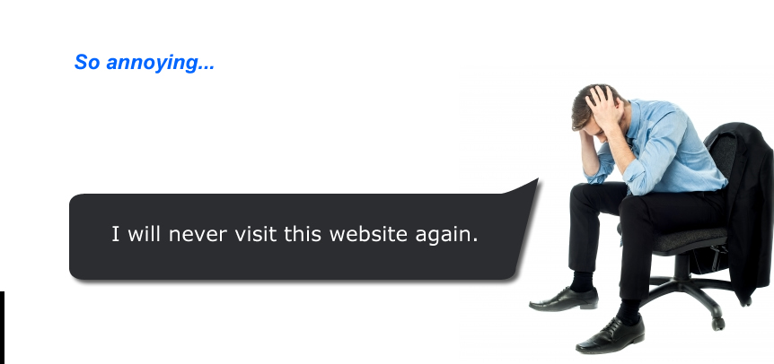
Don’t Annoy Your Users
If you want to build a solid following and attract reoccurring users, avoid annoying design features. Resist the urge to load up your site with every pop-up and sparkly element on the market and stick to a streamlined design that provides easy navigation and a stress-free experience.
Comments are closed.