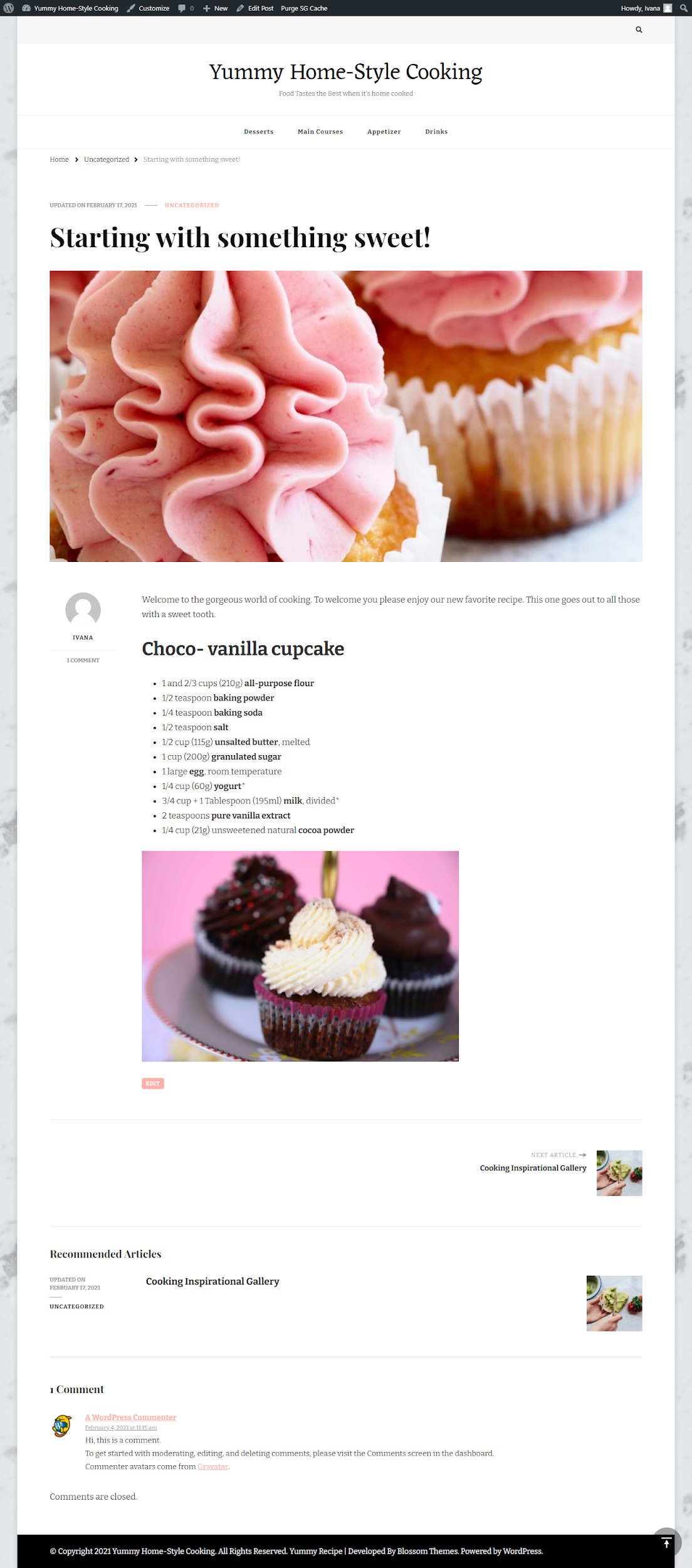
When designing a WordPress site using the Divi theme, one of the most overlooked but critical aspects of visual presentation is the featured image size for blog posts. The featured image serves as a visual hook that draws users into your content and sets the tone for the entire article. Ensuring your featured images are the right size can make a big difference in how polished and professional your blog appears. This complete guide will help you understand the best practices, recommended sizes, and how to customize featured images in Divi.
TLDR: Quick Summary
If you’re using Divi with WordPress, the ideal featured image size for a blog post is 1200 x 675 pixels. This ratio aligns well with social media platforms and ensures consistency across different devices. Divi dynamically resizes images, but uploading images at this optimal dimension saves you from cropping issues or pixelation. If your page layout differs significantly, some manual adjustments may be needed.
Understanding Featured Images in WordPress
In the world of web content, a featured image is a default thumbnail or banner that represents a blog post or a page. In WordPress, it’s typically used for:
- Blog listing previews
- Social sharing thumbnails
- Visual consistency across pages and posts
When you use the Divi theme, this image becomes even more prominent, often taking center stage in your blog layouts. That’s why choosing the correct size is key to balancing aesthetics and performance.
Default Blog Post Image Size in Divi
Divi doesn’t officially enforce a single featured image size. However, the theme’s default blog module and layout settings suggest a specific aspect ratio that looks best across devices. The recommended starting point is:
- Size: 1200 x 675 pixels
- Aspect Ratio: 16:9
This ratio ensures that images look great on retina devices, mobile screens, and social platforms like Facebook, Twitter, and LinkedIn. This size also prevents unwanted cropping or zooming by Divi’s built-in image modules.
Customizing the Featured Image Size in Divi
If you’re using custom blog layouts or the Divi Builder to style your posts, you may want to adjust how featured images appear. Here are a few ways to customize image display:
1. Using Divi Theme Builder
To change how a featured image appears per post, follow these steps:
- Go to Divi > Theme Builder.
- Click Add New Template and assign it to blog posts.
- Add a Featured Image module to your custom layout.
- Set sizes manually under the module’s design settings (width, height, object fit).
2. Via WordPress Functions
For advanced users, you can add custom image sizes via functions.php in your theme:
add_image_size( 'custom-featured', 1200, 675, true );This registers a new image size. Then, use this size in your child theme or Divi modules by referencing it accordingly.

Responsive Design and Mobile Optimization
Divi is a responsive theme, meaning it automatically scales content based on screen size. However, featured images are not always optimized without some manual tweaks. Consider these points:
- Use large, high-quality images (at least 1200 px wide) to ensure clarity.
- Use “Cover” or “Contain” settings in image modules to control cropping.
- Add lazy loading and compress images using tools like TinyPNG or ShortPixel for performance.
How to Ensure Compatibility Across Layouts
Divi allows you to choose between various blog layouts — full-width, grid, and more. Each may display the featured image differently. Ensure compatibility by using the following technique:
- Keep a consistent image ratio (preferably 16:9).
- Preview your blog layout on desktop, tablet, and mobile in the Divi Builder.
- Make custom CSS adjustments if some layouts crop or zoom the image undesirably.
Quick CSS Fix for Image Cropping
If your image is being cropped oddly in your layout, adding this CSS class to your theme may help:
.et_pb_post img {
  object-fit: cover;
  width: 100%;
  height: auto;
}
Social Media and SEO Considerations
Your featured image also affects how your posts appear when shared online. Ensure your images comply with Open Graph and SEO guidelines:
- Use a size of 1200 x 628 pixels for Facebook sharing to meet Open Graph standards.
- Add Alt Text to all featured images to improve accessibility and SEO rankings.
- Use SEO plugins like Rank Math or Yoast to define which image appears when the post is shared.

Best Practices Summary
To recap, here are the best practices for using featured images with Divi and WordPress:
- Use a featured image size of 1200 x 675 px.
- Maintain a consistent aspect ratio sitewide (16:9 works best).
- Test across devices using Divi Preview or inspect tools.
- Compress and lazy load images to increase site speed.
- Customize layouts using the Divi Theme Builder and CSS tweaks.
Frequently Asked Questions
- What is the recommended featured image size for Divi blog posts?
- The best image size is 1200 x 675 pixels, which fits the layout and works well across social media platforms.
- Why are my featured images being cropped in Divi?
- This happens when the uploaded image doesn’t match the aspect ratio expected by the blog layout. Use CSS or Divi’s design settings to correct it.
- Can I use vertical featured images?
- While possible, vertical images may not display well in many blog layout modules. Horizontal images (16:9) tend to be more versatile and reliable.
- Where do I change featured image size settings?
- You can register new sizes via
functions.phpor make visual changes in the Divi Builder using custom layouts and CSS. - Do featured image sizes affect page loading speed?
- Yes. Larger files can increase loading time. Compressing images and using lazy loading helps maintain performance without sacrificing quality.
Conclusion
Getting your featured image size right in Divi isn’t just about looking good — it’s about delivering a better user experience, enhancing SEO, and improving social sharing. Stick to the 1200 x 675 pixel guideline, maintain consistency, and test often. With just a bit of planning, your blog images can look as polished and professional as your writing.
