Whether you’re launching a personal blog or establishing your own brand, your logo is often the first visual impression you’ll make. It’s not just a symbol—it’s a statement of your identity, values, and professionalism. A well-thought-out logo can attract the right audience and establish trust. But creating the perfect design can feel overwhelming. To make the process easier, we’ve curated nine trustworthy and effective logo ideas tailored to bloggers and personal brands looking to set themselves apart.
TLDR: 9 Logo Ideas for Bloggers and Personal Brands
Your logo is a powerful representation of your personal brand. From signature-style wordmarks to minimalist icons, these nine logo ideas can help you craft a memorable and effective visual identity. Whether you’re a lifestyle blogger or a personal coach, choosing the right style will enhance your brand presence. Keep longevity, versatility, and authenticity in mind when designing your logo.
1. Signature Wordmark Logo
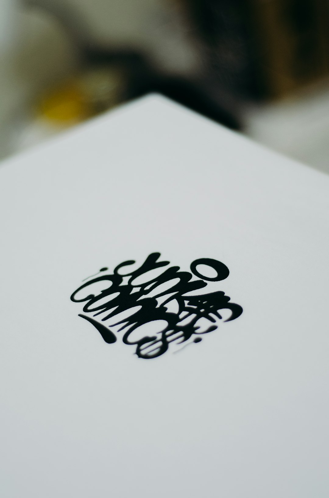
One of the most popular and trustworthy logo choices for bloggers and personal brands is the signature wordmark. This involves using your name—or blog title—in a unique, handwritten or stylized font that mimics a signature. It delivers a personal touch and establishes a direct and human connection with your audience.
Why it works: It’s authentic, timeless, and presents you as approachable and real. Ideal for lifestyle, fashion, or wellness bloggers who are the face of their own brand.
Design tip: To prevent readability issues, keep decorative elements minimal and test the readability across various devices and sizes.

2. Monogram Logo
For a sleek, professional appearance, consider a monogram-based logo using your initials. This is particularly useful for consulting coaches, authors, or creatives looking to position themselves as thought leaders. Think of it as your personal stamp of professionalism.
Why it works: Compact, elegant, and scalable—great for social media avatars, business cards, and website headers.
Design tip: Choose a classic serif font or modern sans-serif typeface, or even opt for a blend depending on the personality you want to evoke.
3. Symbol-Based Logo
If you want a more abstract or artistic edge, align your brand with a symbol or icon that reflects your niche or values. For instance, a book icon for educational bloggers or a leaf for eco-conscious creators.
Why it works: Symbols are universal and versatile. They allow your brand to be recognized even without including the entire brand name.
Design tip: Ensure the symbol relates to your content and brand mission. Use simple vector shapes to maintain clarity at small sizes.
4. Minimalist Typography Logo
Minimalist logos emphasize clarity and sophistication. Often using simple fonts with generous spacing and subtle layout tricks, this style tells your audience that you value professionalism and structure over visual clutter.
Why it works: Clean logos are highly versatile and convey seriousness and brand maturity. They’re also future-proof, as minimalist design rarely goes out of style.
Design tip: Focus on contrast and alignment to make even simple text logos stand out. Avoid overly decorative font styles.
5. Illustrated Character or Mascot
Not all personal brands need to be super serious. If your blog has a fun, quirky side—maybe you’re a parenting blogger, food reviewer, or creative storyteller—an illustrated character or mascot can make your brand instantly relatable and memorable.
Why it works: It injects personality and helps differentiate you in saturated niches. Mascots can also evolve with your content, creating emotional resonance.
Design tip: Commission a professionally drawn avatar-style illustration that embodies your brand vibe. Make sure it adapts well for profile pictures and merchandise.
6. Vintage-Inspired Emblem
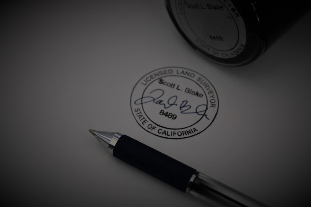
Emblems and badges have an old-school charm that inspires trust and heritage. Great for travel bloggers, style influencers, or handmade craft businesses, vintage logos tap into nostalgia while setting a classy tone.
Why it works: It gives a sense of experience and authenticity. Using serif fonts, borders, and textured color palettes can drive the retro feel home.
Design tip: Keep emblem logos balanced. Overcomplicating them with too many elements can hurt readability and scalability.
7. Geometric Shape Logo
Shapes influence perception. Circles suggest inclusivity, triangles imply movement, squares stand for stability. By incorporating simple shapes into your logo—either around text or as part of a symbol—you define your brand through psychology.
Why it works: Geometric logos are modern, clean, and deeply symbolic. They’re particularly useful in tech, coaching, and productivity-focused niches.
Design tip: Pair geometric shapes with subtle color gradients or shades of a brand color to keep things dynamic and engaging.
8. Name + Tagline Combination
Your name alone might not communicate your niche or value proposition. By combining your name or blog name with a concise tagline, your logo can immediately tell people what you do—ideal for freelancers, consultants, and subject matter experts.
Why it works: Good for newer brands that need to establish clarity. Taglines reinforce your mission so your audience isn’t left guessing.
Design tip: Use contrasting font weights or two typography styles to separate the tagline from the main name and enhance readability.
9. Nature-Inspired Logo
For bloggers in wellness, sustainability, travel, or even slow living, logos with organic elements—leaves, waves, mountains—speak volumes. They immediately convey a connection to nature and a calming, grounded presence.
Why it works: Reconnects with audiences fatigued by aggressive corporate aesthetics. Great for conveying care, balance, and authenticity.
Design tip: Use earth tones and hand-drawn elements. Complement them with a clean serif or script font for harmony.

Tips for Designing Your Own Logo
Now that you’ve seen nine logo ideas tailored to bloggers and personal brands, remember these guiding principles when crafting your identity:
- Keep it scalable: Your logo should look great on everything from social media icons to banners.
- Limit fonts and colors: Too many typefaces or hues can confuse and overwhelm your audience.
- Make it unique: Avoid cliché symbols unless you reinterpret them creatively.
- Test in black and white: A good logo should still function when stripped of color.
Final Thoughts
Your logo is your visual handshake—it’s the first step in telling your story. Whether you’re just starting your blog or rebranding an established platform, choosing the right logo can have a long-term impact on how your audience perceives and interacts with your content. Remember, the best logo isn’t just beautiful—it’s meaningful, functional, and unmistakably you.
Explore these nine ideas, experiment, and don’t be afraid to consult with a professional designer to bring your vision to life.
