It’s been well known that mobile traffic over the internet has been growing over the past few years, but in the last year alone (2013-2014), the growth is up more than most could have ever predicted. With some statistics showing that mobile web traffic now accounts one third to one half of all online traffic, it’s time for us as bloggers to ask ourselves: Is my blog mobile ready?
To get your blog to be mobile ready you first have to ask yourself this question: What does mobile ready mean? Basically the answer to this is whether or not your content, including content you offer on your blog and through email, is easy to view and navigate when using a smartphone or tablet. Let’s face it, if users cannot easily find or read what you have to share on their mobile devices, they’re going to leave and find the information elsewhere.
Using a Responsive design!
One of the best ways for a blogger to make their blog easier to view and navigate is with a responsive design.A responsive design simply means that the web design has been made in such a way that it’s able to detect whether the user visiting your site is using a desktop, smartphone or tablet to view your content. Once it detects which they are using it will adjust how the content is presented so that it fits the dimensions of their device. This ensures that the content is rendered in the best possible format.
A responsive design isn’t only something you need to look for in your theme though. If you’re using emails in any way, such as sharing your newsletter or blog highlights on a weekly or monthly basis, you want to make sure that you’re using an email marketing service with responsive email templates. With an estimated 82% of people using their mobile phones to check their email, ensuring that your email is best optimized for their device is a must if you don’t want to lose followers + make sure that you’re using an email marketing service with responsive email templates
In addition, when looking for templates to use for your blogs, ensure that they’re mobile ready and responsive as purchasing a theme or investing in a design without it is a terrible mistake.
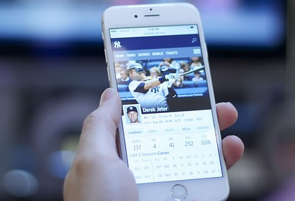
Mobile App
Another way to make sure that your blogging efforts don’t go to the wayside with mobile users is by having an app made for your blog. Mobile apps are one of the best ways to attract and keep your mobile audience since they provide a smooth experience for your user, so scoping out the best app design firms is the next step to improve your business.
One interesting option for WordPress users is AppPresser, which allows anyone to easily launch mobile apps using their integration tools and software. The great thing about this service is that it relies on your basic WordPress skills rather than coding in Java and other complex languages. It’s worth a try and will cost a lot less than paying a developer.
Other ways to make your blog mobile friendly

Even if you’re already utilizing a responsive design or a mobile app, there are other things that can be done to make your blog mobile friendly. These include basic standards on how you treat your text, images and videos. Get your smartphone or tablet ready and begin experimenting with these ideas.
Text: For mobile users you want to remember this rule: Keep it short and simple. By keeping it short and to the point you’ll keep their attention. Also, useappropriate bullet points, bold font, font sizing and spacing to create a seamless reading experience. To see how your post looks and how easy it is to read, use your mobile device to view it. Go through and bold certain points of interest, especially headings, and make sure paragraphs are not too long.
Images: With images remember this….size matters. On a desktop image size may not seem so noticeable within a post or an email, but when viewed on a smaller screen it can matter a lot. Not only do images take up more space in your post, they will take longer to scroll past as they take longer to download than text does. Images are not a complete no-no, you should use them, just watch how many you use and ensure they’re within a manageable size.
Video: Video is more popular than ever; in fact, over 50 percent of all mobile traffic involves online video accounts. This number will only keep rising, so making sure that any video you share is mobile optimized is very important. To be sure that your video is mobile optimized use CSS and HTML 5 players, and eliminate any Flash, as it’s not compatible with all devices. This will ensure quality, viewable video content for all mobile visitors.
With over a billion people using a mobile device to access the internet and their emails, making sure that your content is mobile ready is imperative. This means choosing whether your blog site is going to have a responsive design, a mobile app, or both. Whatever you decide, don’t stop there.
Test to ensure that it’s also easy to view from your visitor’s perspective with the text, images and video’s you have included. Keeping an eye on your content and how it’s viewed on any device will ensure that you’re going to stay competitive in the mobile market, not just now, but also in the future.
So let’s talk!
How much attention do you pay to theme responsiveness? I’d like to hear your thoughts in the comment box below. If you like this post, do share it on social media too 😉
Comments are closed.